Level up your workforce with OrgPlus® RealTime
Insperity® OrgPlus® RealTime is a cloud-based organizational management solution. It empowers businesses to strategically plan, refine and analyze their entire workforce to make more informed decisions and better adapt to organizational change.
Who it helps
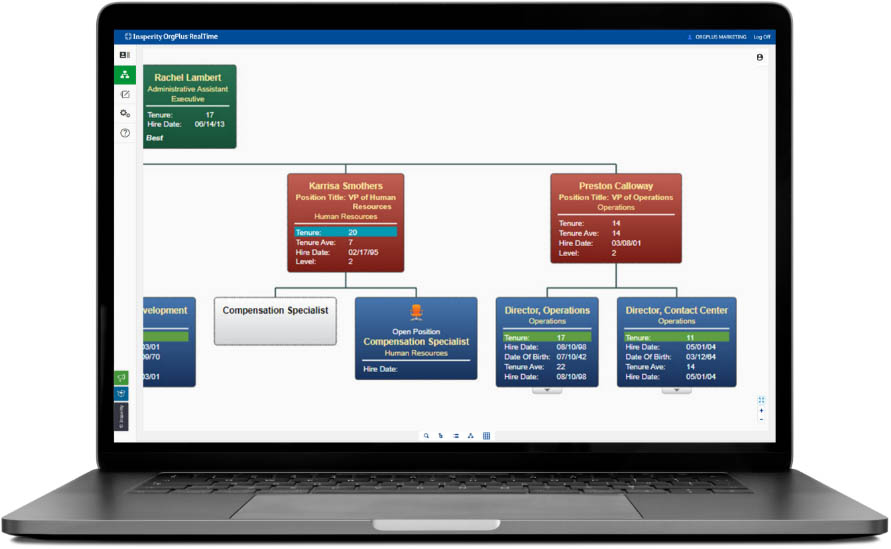
Manually drawing organizational charts can be time-consuming and may not contain all the information available. OrgPlus RealTime gives executives, HR professionals and managers a collaborative organizational planning experience.
It provides critical insight into company data and employee analytics, enabling smarter decisions about how to align and optimize your workforce. Additionally, employees can take advantage of the directory view to quickly find team member contact information.
Here’s what’s in store
for you
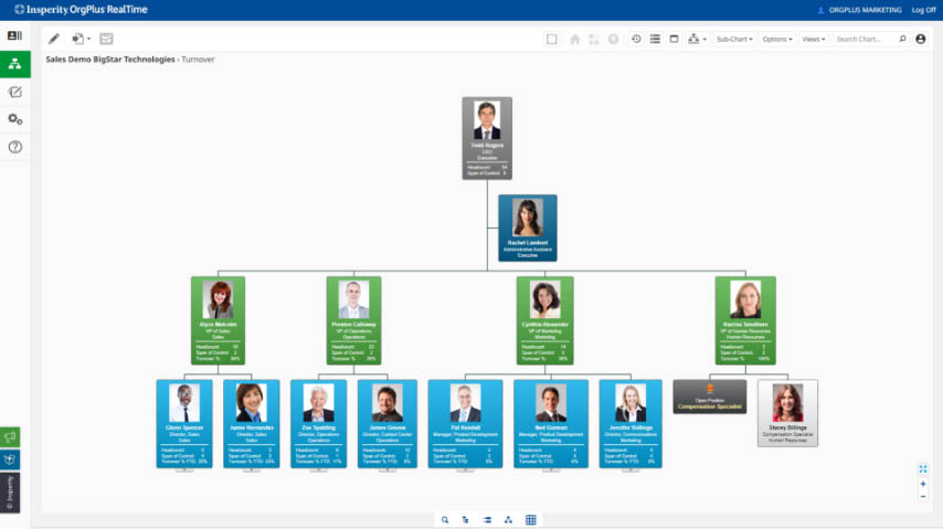
Insperity® OrgPlus RealTime is ideal for creating org charts, getting insight into potential workforce changes and allowing for better collaboration and sharing of organizational plans. OrgPlus RealTime helps you create an appropriate structure for your business, make better strategic decisions and manage workforce changes.

OrgPlus RealTime helps you:
- Track and measure key employee metrics, such as performance rating, compensation, budget and headcount and other data that is important to your business.
- Gain insight into how workforce changes can affect your organization.
- Visualize your company’s important data to help manage your workforce. Easily and effectively manage changes under a merger or acquisition.
- Minimize maintenance with an in-the-cloud infrastructure with no desktop hardware, a limited initial investment and online access using a variety of compatible web browsers.
- Retain a full audit trail to track changes made to your organizational structure and generate change reports to update your human resources information system.
How it works
With OrgPlus RealTime, you can start visualizing your organization immediately after signing in. Simple user interface controls, navigation and workflows reduce the time it takes to produce high-quality org charts.
You also control who sees what. Administrators create roles to define which org charts, sub-charts, employees, fields and features each user can access. No more silos of information and maintaining multiple data sources to accommodate different business segments or security preferences.
Robust features and benefits
From business visualization to compliance cues, explore what OrgPlus RealTime can do for you.
-
Business visualization
Fully customize OrgPlus RealTime to visualize your business’s performance in a uniform hierarchical structure.
-
Online collaboration
Role-based access options and drag-and-drop functionality allow you to share plans and what-if scenarios with colleagues in the process of finalizing your organizational structure.
-
Planning and modeling
Using our convenient, easy-to-use staging area, create new plans and develop unlimited options for potential upcoming organizational changes to maximize efficiency.
-
Ongoing updates
Product updates and maintenance occur automatically and are included with the service; no need to purchase separate support and maintenance packages.
-
Customizable views
Create custom views for any business metric that’s important to your company’s success such as sales, operations and human resources data.
-
Fast searching and filters
Quickly find a single employee or use filters to compile a list of employees who share common attributes.
-
Conditional formatting
Highlight employee profiles to bring attention to specified criteria.
-
One-click publishing
Easily publish your org charts to PDF, PowerPoint or Excel.
-
Role-based access settings
Administrators define which org charts, sub-charts, employees, fields and features each user has access to.
-
Compliance cues
Manage a reduction in workforce and avoid targeting key areas like age and ethnicity.